Favorites Feature for Quick Access to Frequently Used Reports
ActivTrak is a cloud-based workforce analytics SaaS platform that tracks employee activity (e.g., app usage, websites, idle time) and delivers productivity insights via in‑app dashboards or BI integrations
Challenge
The Customer Success Team informed the Product Team that new and existing customers had difficulty navigating the ActivTrak app. Most complaints were about finding reports and rediscovering previously used reports. Our goal was to come up with a solution that could be quickly implemented and address customer frustration. Outcomes
We designed and implemented a Favorites (pinning) feature that allowed users to pin frequently used report pages. Within the first five business days of Early Access, 82% of users engaged with the feature—significantly improving report access and easing navigation pain. The Customer Success Team reported positive feedback from users who found the navigation much easier to manage. We also sent out a short questionnaire, and 59% of respondents said they loved the feature.
Approach
Understanding Mental Models Through Competitive Analysis
Our UX researcher reviewed platforms like Microsoft Power BI, Google Analytics, and Heap to understand common patterns and mental models for report pinning. Since 80% of our customers were Microsoft users and already familiar with data tools, aligning with established interaction patterns was key to reducing friction and improving usability.
Balancing Design Decisions with Technical Constraints
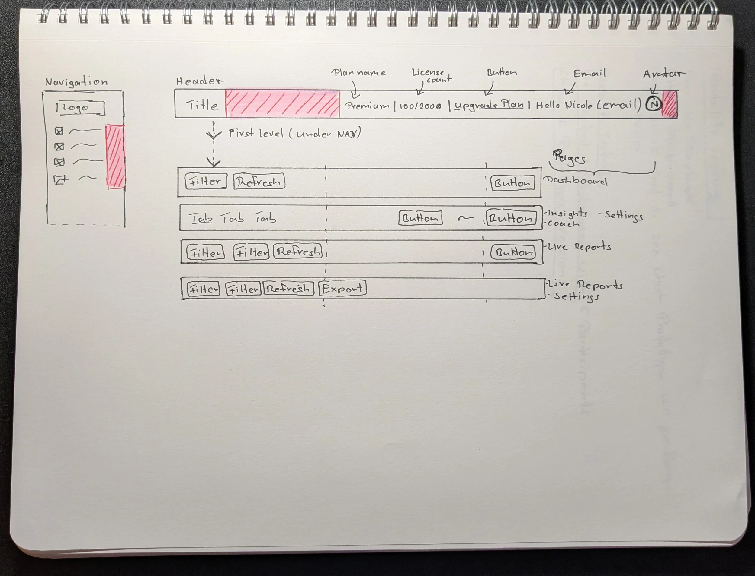
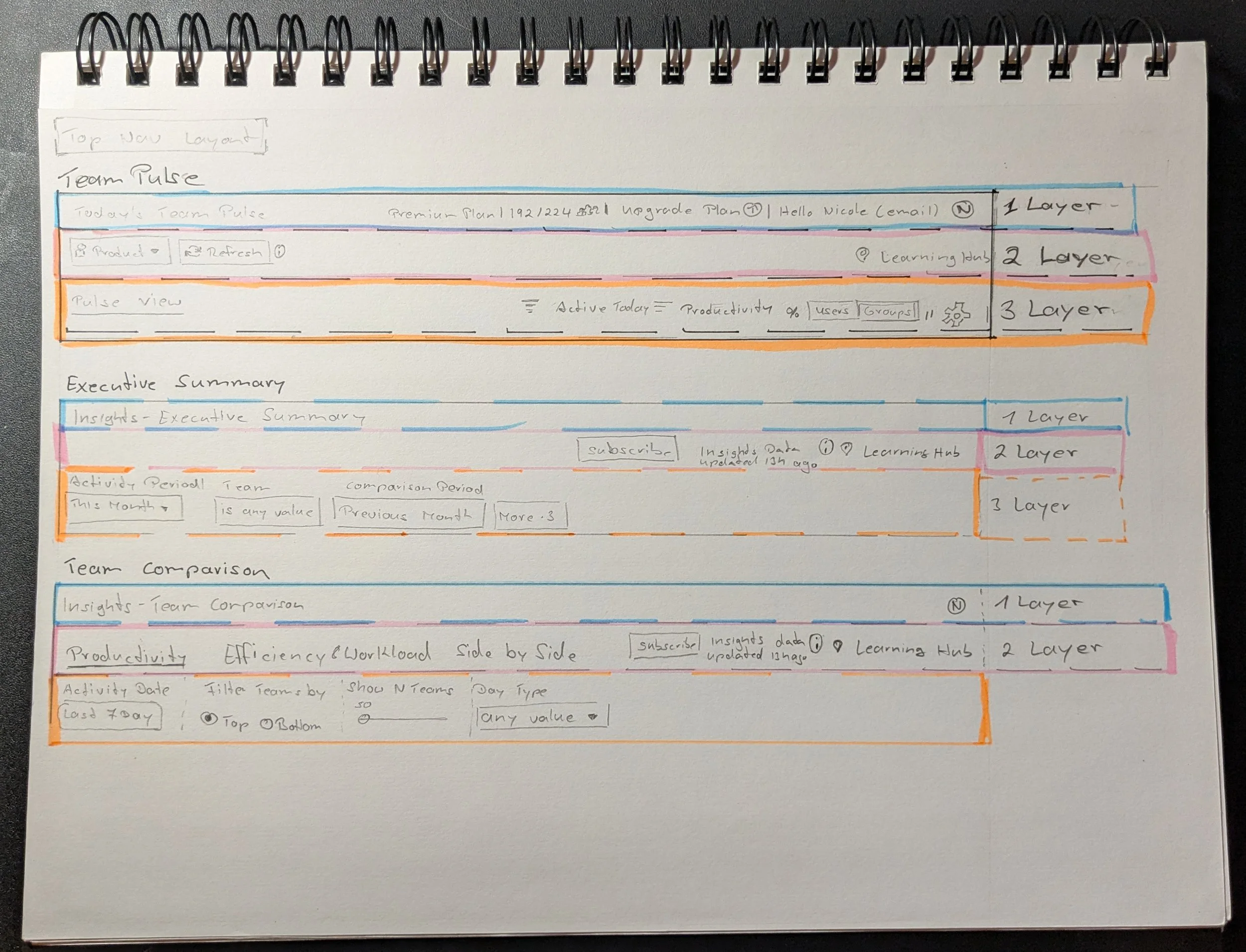
Competitive analysis revealed two common approaches: some tools, like Heap, allowed users to save reports within dashboards, while others, like Power BI, supported pinning items directly in the navigation. Due to technical constraints—specifically the embedded Looker app that powered 35% of reports—pinning was limited to the top header or navigation. Engineers also confirmed that only full pages could be pinned, not individual reports. I collaborated with Engineering and Product to evaluate these limitations and decided to place the Favorites feature in the navigation and header to learn which access point was preferred by users.
Development sketches from this process
Testing the Prototypes
I built two Figma prototypes and we tested them with five users in UX Playbook. Both included the pinning feature in the navigation but differed in the header design. One showed the feature visibly, the other nested it under a “More” menu. We tested how easily users could find the feature in each version. The “More” menu also helped explore how users might respond to a scalable header, as additional features like print were being considered.
Test Results
Each participant tested two versions of the prototype. In the version where the feature was placed visibly in both the navigation and header, all participants were able to find and use it without issue. In the alternate version, where the feature was hidden under a “More” menu in the header, users struggled to locate it. On average, participants completed the task 3–4 minutes faster when the feature was clearly visible in the navigation and header.
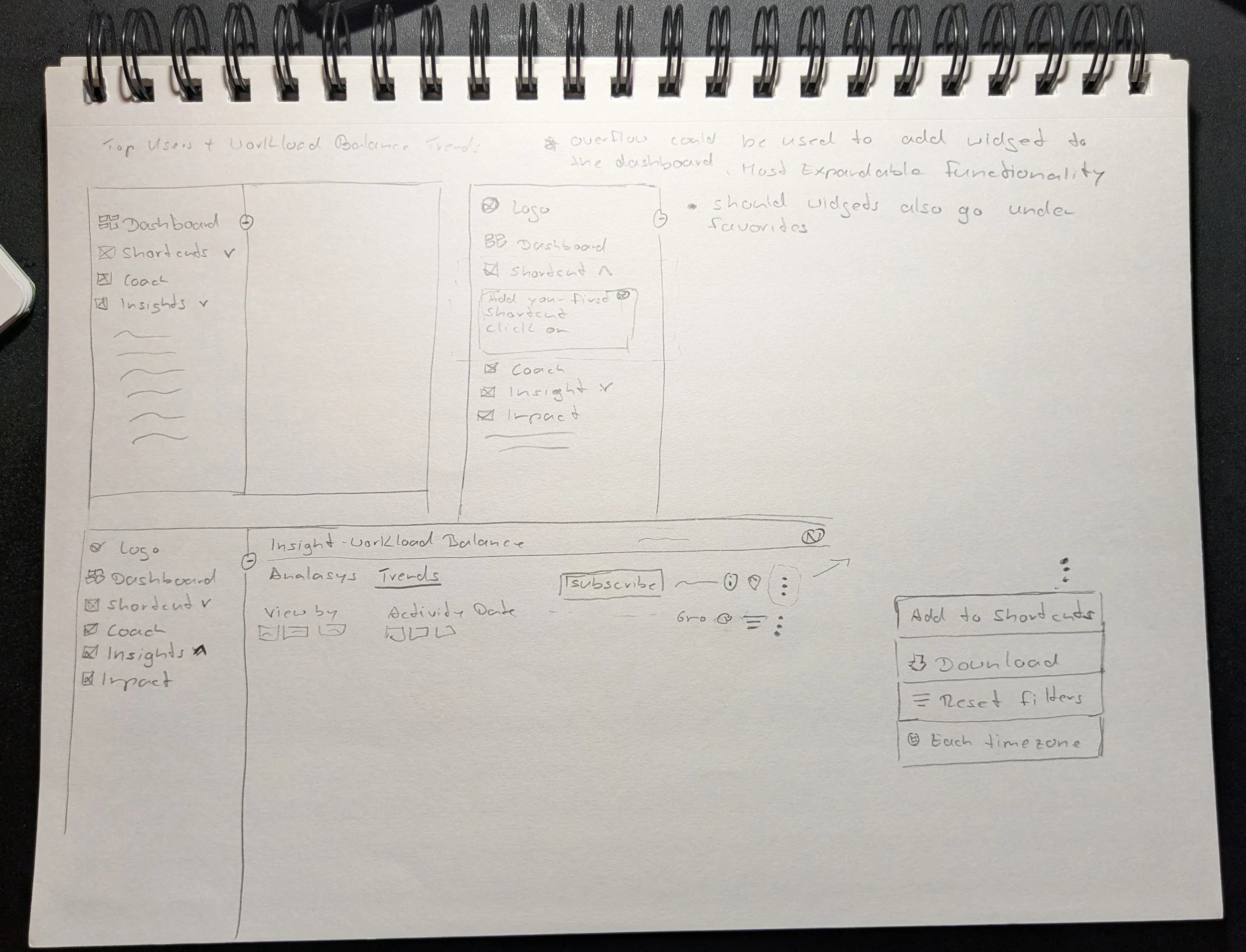
Resolving Space Constraints for Icon Placement in the UI
We decided to place the Favorites feature both in the navigation and visibly in the header, based on testing outcomes. However, this introduced layout challenges. The navigation had no space for a new icon, and many existing labels were long—averaging 12–17 words. I identified this constraint early and proposed widening the navigation to accommodate the new feature. This solution was reviewed and approved by Engineering and Product.
Working Out the Details
With the placement confirmed, I began defining the design requirements needed to support implementation. This included:
Empty state behavior
Navigation interactions
System feedback
Edge case scenarios and messaging
Visual states (default, hover, active, etc.)
Early Access Results
The feature was released to 10% of paid customers—937 accounts, representing approximately 22,000 users. Within the first five days, 82% of users engaged with the feature. A follow-up survey showed that 59% of respondents said they loved the feature.
Showing the feature live in the ActivTrak app
Next Steps & Key Learnings
The rollout was successful, and the Favorites feature became one of the most-used in the platform. Initially, users could pin up to five reports, but due to high demand, we increased the limit to ten.
One usability issue emerged post-launch: the Favorites section in the navigation was always expanded on login. Users expected the app to remember their last action—if they had collapsed the section previously, they wanted it to remain collapsed on their next visit. This feedback highlighted the need for more persistent UI behavior to support user preferences.